Designing a Logo That Resonates with Your Target Audience
A logo is much more than a pretty picture. It’s the face of your brand, a visual shorthand for your values, and often the very first thing a potential customer sees. But a great logo isn’t just about good design; it’s about connection. The most effective logos are those that resonate with your target audience, speaking their language and reflecting their identity. So, how do you create a logo that doesn’t just look good but also builds a bridge to your customers?
1. Know Your Audience Inside and Out
Before you even think about shapes and colors, you need to understand who you’re talking to. A logo for a Gen Z-focused tech startup will look radically different from one for a luxury skincare brand aimed at mature professionals. Dive deep into your target audience’s demographics and psychographics. What are their values? What aesthetics do they appreciate? What kind of brands do they admire?
For example, if your audience values sustainability and natural products, your logo might feature earthy tones, organic shapes, or a hand-drawn feel. If they’re drawn to cutting-edge technology and innovation, a minimalist, sleek, and futuristic design might be more appropriate. Don’t just make assumptions; conduct surveys, analyze social media data, and create detailed customer personas. The more you know about your audience, the more intentional your design choices will be.

2. Uncover Your Brand’s Core Identity
Your logo needs to be a visual representation of your brand’s essence. Before you can design a logo that speaks to others, you must first define what you stand for. What is your unique selling proposition? What are your core values? Are you playful and quirky, or serious and professional? Do you prioritize tradition or innovation?
Think of your brand’s personality as a person. Are they a friendly neighbor, a wise mentor, or a rebellious innovator? The answers to these questions will inform every aspect of your logo design, from the typography to the color palette to the overall style. For instance, a brand that’s all about comfort and community might use a warm color palette and a soft, rounded font, while a brand focused on precision and efficiency might opt for sharp lines and a bold, sans-serif typeface.
3. The Psychology of Shapes and Colors
Every element in a logo has a purpose, and colors and shapes are loaded with psychological meaning. Choosing them with your audience in mind is crucial.
Colors: Blue often represents trust and stability, making it a popular choice for financial institutions. Green evokes nature and growth, perfect for eco-friendly brands. Red signals passion and urgency, often used in food and retail. Understanding these associations can help you choose a palette that subconsciously communicates the right message to your audience.
Shapes: Circles and ovals suggest community, unity, and harmony. Squares and rectangles convey stability, strength, and professionalism. Triangles can imply power, energy, or direction. Even the negative space within a logo can be used to create a hidden meaning or reinforce a message.
Think about how these elements can work together to tell a story. A logo for a children’s toy company might use bright, primary colors and rounded shapes to feel playful and approachable, while a law firm’s logo would likely use a more subdued palette and strong, geometric shapes to convey seriousness and reliability.
4. Simplicity is Key (Most of the Time)
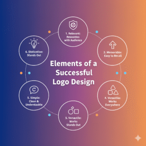
While it’s tempting to cram a lot of meaning into a logo, the most memorable designs are often the simplest. An effective logo needs to be versatile and instantly recognizable, even at a small size. A complex design with too many details will lose its impact when scaled down for a business card or an app icon.
Think about the logos of major brands like Nike, Apple, GTBank, MTN, Glo or McDonald’s. They are incredibly simple, yet instantly recognizable. This simplicity allows them to be used across a vast range of mediums without losing their power. A simple design is also easier for your audience to recall and connect with.
However, “simple” doesn’t mean “boring.” It means focusing on one or two strong concepts that clearly communicate your brand’s identity and resonate with your audience, stripping away anything that doesn’t serve that purpose.
5. Get Feedback and Evolve
Once you’ve created a few concepts, don’t keep them to yourself. Show them to a group of people who fit your target audience and get their honest feedback. Do they understand what the logo is supposed to represent? Does it evoke the right feelings? This is where your initial research pays off, as you can test your design choices against real people.
Remember, a logo isn’t static. As your brand grows and evolves, your logo might need to as well. The key is to design with a deep understanding of your audience from the very beginning, creating a visual identity that is not just a mark, but a genuine connection.
A great logo is an investment in your brand’s future and it is one of your brand asset that needs trademarking. By focusing on your audience and your brand’s core values, you can create a logo that doesn’t just stand out, but truly stands for something. What message is your logo sending?
Ochidoz Ltd can handle your logo design professionally. Click here to send us a WhatsApp chat or give us a call at +2349061182744

